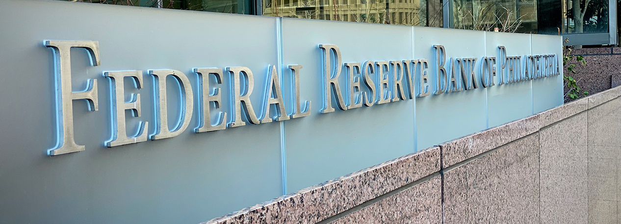

The Federal Reserve Bank of Philadelphia has a new look.
The flagship of the new brand identity is the newly redone and modernized PhiladelphiaFed.org. Launched in November 2020, the refreshed website was reimagined to position our content more intuitively, better serving compelling content to digital audiences in the formats they preferred — shorter text, more conversational writing, and increased visuals and images.
Along with the launch of the new website, the Philadelphia Fed unveiled a refreshed, more contemporary logo, with a distinct eagle shape, new colors and fonts, and a streamlined design. Our new logo reflects our more direct and open way of communicating what the Philadelphia Fed does and what we stand for. The bold eagle shape symbolizes our connection to the strength of the Federal Reserve System, while the forward motion created by the eagle’s head facing to the right represents the Bank’s reputation for industry-leading research and initiatives that help move communities forward.
The new logo made its debut on the website in late 2020 and will be phased into publications, event materials, and social media — although it may take a while for us to fully transition to the new brand everywhere you may see us.
An organization’s visual identity is a critical part of telling its story, and the new website and logo are the next chapter in our narrative to the community. And while the new website and logo position us to tell our story in a more compelling, modern way, our commitment to our core mission to protect the U.S. economy is unwavering.
As the economic landscape evolves, we will continue to innovate the ways in which we carry out our mission. The new website and brand convey that forward-looking approach to serving the communities of the Third District — and the nation.